The Crispy Noodle Concept Art
Late one night while brainstorming, we started throwing around ideas for a logo. We decided that we wanted to capture everything we hope to cover with our website and podcast: odd news, entertainment, sports and whatever the heck we want. The next day, I decided to actually put in a little effort and draw a concept sketch of the logo. While it’s a far cry away from where we want it to be (the final version will be in color…and have less eraser marks), I felt that it was a good idea to share this early concept art.
Update:
I decided to find more of our early concept work, just so everyone can have themselves a good laugh.
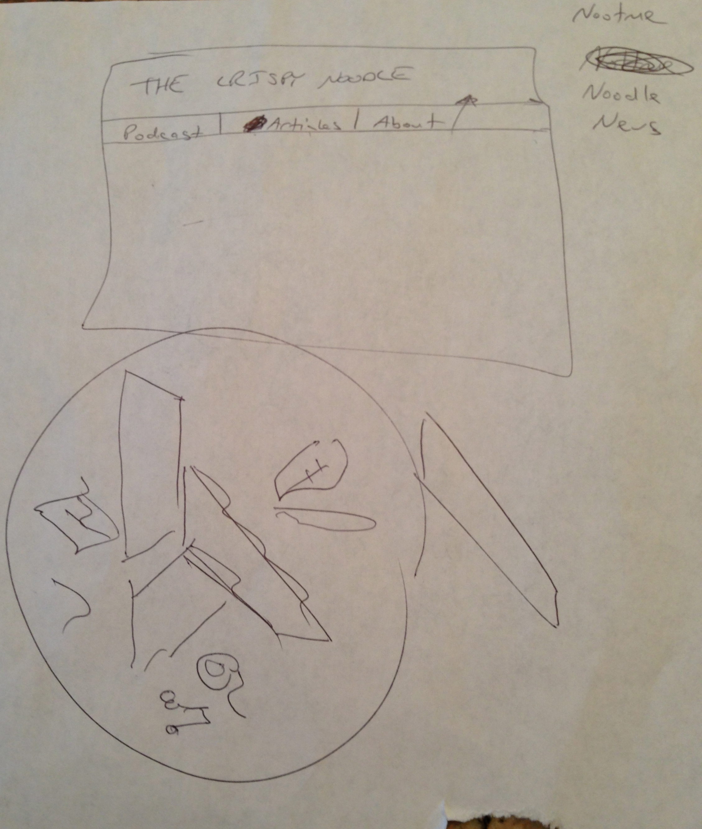
This is the first piece that we worked on. Here we were just figuring out the titles of various sections and the general layout of everything. More interesting is the failed attempt to rip off the�Abstergo logo from the Assassin’s�Creed�Video game series (just look it up yourself). My initial thinking was to use the three sections to represent each topic we’d hope to cover. If you look closely and live in a dimension where blobby shapes make sense, you can make out a music note, a film reel, a football, a bat, a really messed up book (?) and a hill (?). Needless to say, we didn’t really like it. In fact, the only thing that stuck from these first scribbles is the titles of the various sections for the website.

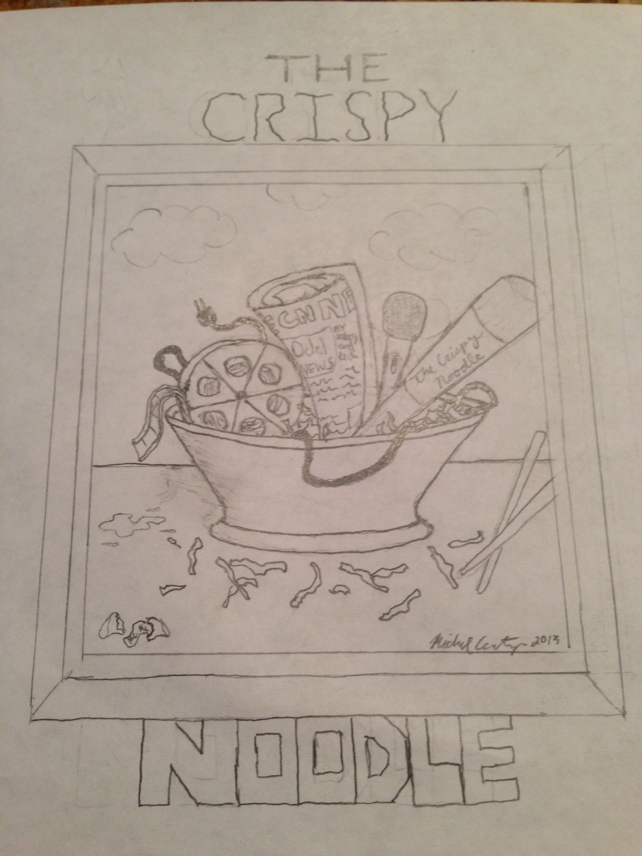
By the way, yes, I did just take pictures of the paper. No, it wasn’t because I’m lazy…ok, fine, it was. But the other reason is because we drew on both sides of the paper, so both sides showed�through�when I scanned them. Anyway, this last set of concept art was the second round of edits. In the top most image, we decided to do a circular logo with some objects representing our subjects. It was basic and simple. But then I thought, “Why don’t we put everything in a bowl of crispy noodle?” I came up with that�idea�mainly because I have no idea how crispy noodles are served…my Chinese take out place just serves them in a little bag. Regardless, the drawing on the right is the rough sketch of what we decided on for our final logo.
Obviously, some changes were made, and more changes are on the way. We’ll probably never finish tweaking and perfecting our little endeavor here. True, these are humble beginnings (I mean, just look at some of these drawings, guys),�but all great journeys need a beginning, an origin story, if you will. And I like a good origin story. While it may not be much…
![]() …but it’s our “something,” our origin story.
…but it’s our “something,” our origin story.